
Case Study Coffee House
who is Alaina’s Coffee???
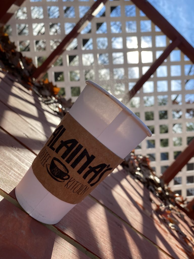
Alaina’s coffee is a small coffee house chain that is located in Rhode Island. While they offer many services within the confines of coffee and more here is some amazing information discovered!
- multiple locations including Richmond and East Greenwich
- located right off of Interstate-95
- Serves a house blend coffee unique to Alaina’s
- serves made in house sandwiches to order
- huge parking lot
- rotating daily menu
- Unique decor displaying local artwork and a cat pillow
- Free WIFI
- group seating
Their Challenge
The main issue of Alaina’s Coffee is wayfinding. Being able to identify how to get to and where the building is. Also important was the brand identity of the store. Rebranding the logo was also crucial in the redesign. The problem was an unforeseen issue because of the location itself. while offering many affordances there’s just as many issues. The client’s expected outcomes are to increase the overall sales margin and at a minimum, drive in the potential one-time visitors who can then become regulars based off of the location alone. Alaina’s chose to engage with digital squatch based off of our previous work client’s along with the varying degrees of work we are able to completely succeed in despite the changes in design style. The
Your Solution
Section 3: Your Solution
How did you approach the challenge?
Initially approaching the project, it was important to understand that the re-brand still needed to have the same feel as the business wanted to project. This was a brand-new challenge as it trying to re-brand while keeping the same feel as the inside of the business was a new challenge all together. Research began with visiting the coffee shop and actually ordering a few menu items, then while sitting in the building using a notepad to observe the average interaction in the restaurant. taking notes of what was ordered, how often and the typical sort of interaction with regulars and non-regulars. The next step was to take note of the surrounding area including the parking lot and any other close competitors. The client was collaborated with on the actual design, but no additional input was required. The solution was to come up with new designs with the client. implementing new logo changes and signage. This was displayed through social media along with Keurig boxes and t-shirts with the new logo design. These were chosen as they have the maximum outreach with minimum risk factor in the long term. It took approximately a few days to plan, a few weeks to develop and then a few weeks to implement the design.
Results (Hypothetical)
Section 4: Results (Hypothetical)
Hypothetically of course the problem does get solved. In the short term the client would see an overall social media boost due to the way Instagram/Facebooks algorithm works. Seeing an overall traffic increase which can lead to far more in store sales. In the long term increased promotion would create a far more stable customer base across all stores allowing for further expansion and higher profit margins. Specific data that can be provided includes sales reports, and online traffic tracking. Starting from when the new logo and designs are implemented and going for 3-month periods at a time. The most important data point is actually online traffic as social media is currently the main way in which word of mouth is spread and word of mouth especially in food business is free advertising with the bonus of guaranteed sales. In the end the client would agree the desired results were met
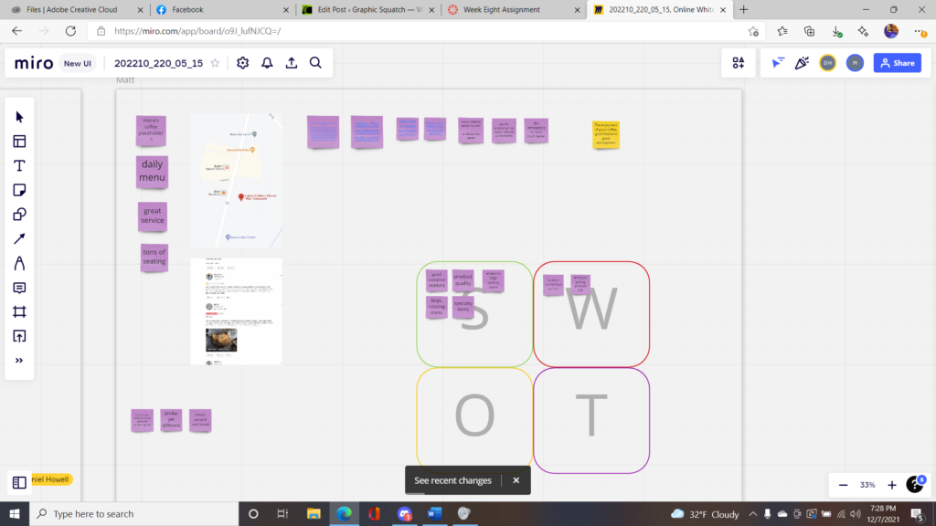
Critical Stimulus
Miro was important as it allowed a visual way to track each step of the re-branding process, business strengths, weaknesses, value props and more were all added to the board.
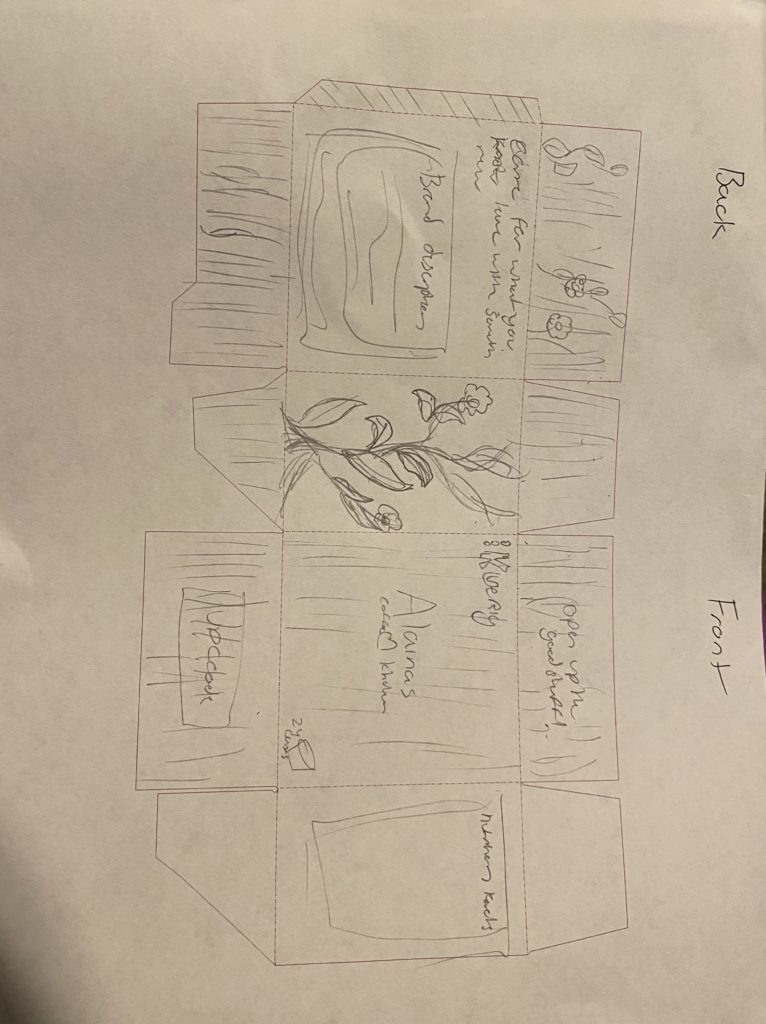
Paper Prototype
Section 6: Paper Prototype
Digital Prototype (Content Marketing or Mobile)

Finished design prototype


